1. In what ways does your media product use, develop or challenge forms and conventions of real media products?
Short films that have inspired me and illustrate typical features of short films
1. Narrative -As illustrated in 'Two Cars One Night', a common feature of a short film is a simple narrative/idea as simple ideas usually are the most creative in terms of short films.
2. Mise En Scene - Another typical aspect of short films is that are a limited number of locations as there is less time, too many locations and changes can take away from the narrative and take up too much time in a short narrative.
3. Representation of characters - In all the short films I watched for inspiration, a modern representation was used rather than a traditional representation.
4. Characterization - Most of these short films use indirect characterization so that we are left to determine the character and their personality's ourselves rather than being told their characterization.
5. Genre Conventions - Even though the genre of all the short films are different, they all have a similar convention in that they all use a genre and story that we can all relate to and understand the story and connect more to it.
6. Editing/Post Production - A common feature is to have minimal diegetic sound and use more non diegetic sound. 'Love Sick' is an example of this as it used a soundtrack and a voiceover throughout.
7. Narrative Organisation - A common feature that inspired our film was the use of flashbacks so that it made the narrative organisation more interesting and the audience find it more intriguing.
8.Editing/Post Production - Another feature I identified is the brightening and colour of images to convey moods and differences between scenes. Box number 7 shows 'Love Sick' and they took the colour of the image down and added a grain effect to give the look of an old camera along with the noise and showed the that it was a 'flash forwards'. Box 8 shows the brightening of the image to reflect the mood of the film and show happiness through the frames shown.
9. Narrative - Another common feature that inspired us was that most films incorporated a twist in the narrative. This allows the narrative to surprise the audience and change the tone of the film while taking the story down a different path the audience weren't expecting.
Does our short film use, develop or challenge forms and conventions of real media products?
· 1. We used the convention of real media products by using a Simple narrative. This we felt was a convention we really wanted to use as the most successful short films have a simple narrative throughout. We used a simple narrative by not over complicating our story with twists throughout and lots of characters in the short time. We stuck by one simple yet effective idea like real media products do so we used this convention in our short film. All of the short films that inspired me had a very simple idea/narrative but were effective by their use of editing, camerawork etc.
2. Our short film also used conventions of real media products that inspired our film by incorporating Flashbacks. A few of the films that inspired our film used flashbacks throughout which were effective in the story like 'About a girl' or flash forwards like 'Love Sick'. We developed the convention further by adding more than 1 in and used the flashbacks to really get a look in to the characters relationship and used dramatic irony to add another dimension to our narrative.
·
3. We also used a limited number of locations like 'Two cars, One night' and 'The View' as with a short film there isn't much time and so to be changing locations a lot and justify why it has changed in the narrative would take up time and take away from the story so we kept our locations limited. We used a few but only showed them for a short time as they were flashback sequences. We also used locations like in the two films that inspired us that could relate to the audience and have recognition with them.
4. We represented our characters in our film in a modern representation rather than a traditional representation. We did this like the film 'About a girl' did as it means our target audience for this film could relate to the representation and the characters better and understand them more.
5. We used a convention some of the other films did and didn't use a normal chronological order narrative organisation. We had a use of flashbacks which I have already explained about and used these to make the narrative and narrative organisation change so that it wasn't a boring usual story line and kept the audience intrigued throughout as to how they related to the characters.
6. Like most real media products, we used the convention of a range of shots sizes and angles. We used various shot sizes and angles to make the audience, for example, relate to the character better in a point of view shot or get a feel of their relationship by their body language in a long shot. The use of various shots and angles were also used in our film because they make a more interesting film to watch rather than from just one angle.
· 7. In terms of genre convention and other films that inspired me, we took inspiration from their genre conventions as they all used a genre and inside that, a narrative that the audience can relate to. Which a genre convention that people can relate to and a narrative then people can, it creates a connection between the audience and story they are experiencing and is effective and creates a successful film as people can relate to it and say they've been in a situation like it.
· 8. In the media products that inspired me, a few that were effective to me focused primarily on non-diegetic sound. In our film we challenged this convention of some films and had an good mix of diegetic sound and non-diegetic sound so that while the music played a big part and set the mood and tone of the film, the diegetic allowed the audience to hear what was happening on the screen at that time and so they knew what was happening as they could hear everything.
·
9. We took inspiration from the real media products we looked at and used the convention that most the short films had which is in the narrative there is a twist. In our film, by using this convention we were able to accomplish a more humorous feel to the end and an abrupt change which worked well with the story and added to the reality of the story.
- The film's name needs to be displayed so that people can read it clearly and see what film the poster is advertising
- Images also should be included and should reflect the movie in some way; Genre, actors etc.
- The actors name can also be a convention used on movie posters; however it is dependent largely on how known the actors in the film are as highlighting unknown actors won't help promote the movie as people won't know who they are.
- A tag line is also a convention used as it gives the audience a insight into the story and what it's about.
- The date it is released should also be included to tell the audience when they can see it in cinemas and it also should be displayed where they can see it: Cinemas, theaters or both?
- What also needs to be included is the text at the bottom displaying production companies, cast and crew members and funding logos.
- An added convention is also quotes the film has received from reviewers that they want to put on the poster to show that is a good film.
- These conventions are mainly for a big budget film poster though which has some anticipated release rather than a short film and so a short film poster may not use all these conventions as it differs from a big budget film and doesn't have such a wide audience and anticipate release.
Does our poster use, develop or challenge forms and conventions of real media products?
We used all the film conventions that can be used on real media products on our poster (below) :
- The film's title is located at the bottom in a large font and number so it stands out and is easy to read for the audience to immediately understand that because it is the largest text on the poster, it is the title of the film.
- We decided to only use one image as this would keep our poster simple and the simplicity of the poster then reflected our film and the simplicity of our film and it's narrative. We used an image of our two characters on the train to hint to the audience the location of our film very subtly.
- The actors names were also a convention of movie posters we used. Even though our actors are not big Hollywood stars, we decided to out the names on anyway to give them some recognition but made the names quite small so that it wasn't a main part of the film poster as it wasn't as important as some of the other features on the poster.
- A tag line is also a convention we used as this allowed the audience to have an insight into what this film could be about and make the audience more interested into what it is about.
- The date it is released we also used and used it so that it could tell the audience when they can see it in cinemas.
- A convention of posters we didn't use however is where the audience can see it : Cinemas or theaters. This is because our film is only a short film and so it wouldn't be displayed in many places or in places like cinemas so there was no reason for us to use that convention as it wouldn't be relevant for our film.
- What also used and made the text at the bottom displaying production companies, cast and crew members and funding logos as these should be identified on posters to highlight people and company's who have helped in making the film.
- The last convention we used were quotes from reviews. We put these on our poster to highlight to the audience the good points of the film so that it would attract more attention and a more positive outlook on our poster as it showed that this film was reviewed well.
Review
This is what the magazine version of Little White Lies reviews look like.
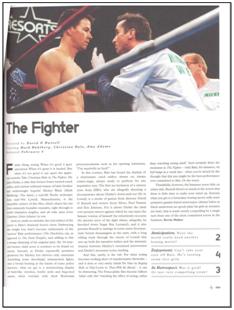
Conventions of Little White Lies Magazine:
Layout
- Screen-capture from film or a still image at the top of the review page to illustrate and show the audience what this film is about.
- The title of the film the magazine is reviewing in bold and a large font number.
- Three subheadings below the title: 'Directed By:', 'Starring:' and 'Released:'.
- Ratings out of 5 given for the film at the end with the headings: 'Anticipation', 'Enjoyment' and 'In Retrospect'.
Language
- Around 400 to 500 words long
- Avoid giving away spoilers in the text
- Restricted code in the language used
- References to other films
- Use of adjectives
- Use of complex nouns
- Use of quirky language/ text throughout
Does our review use, develop or challenge forms and conventions of real media products?
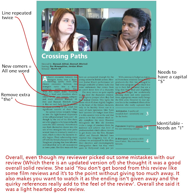
Here is our review:

In our review we used the conventions of Little White Lies Magazine. We didn't develop or challenge the conventions of the magazine otherwise it wouldn't reflect the magazine itself and we then wouldn't have written and copied the format of the magazine.
2. How effective is the combination of your main product and your ancillary tasks?
This will be recorded
I think the whole of our portfolio we have both created together would work well in a real commercial context. All of the pieces work well with each other while also being creative on their own as stand alone pieces and highlight our skills well and put them to the test.
How the two ancillary tasks would work as part of the whole marketing package represented by the portfolio would depend on how we used these ancillary tasks and if we used them to the full extent we could. These ancillary tasks would be our advertisement for our film and so we would have to make sure the pieces are displayed in the right places and used in the right ways to advertise to our target demographic.
We would probably advertise a lot on the internet on sites which attract mid-teenagers to young adults and use our poster on these sites. Where we would advertise with our poster would be a big thing to think about. Other places the poster could be advertised is bus shelters and outside small cinemas or theaters which show short films. Another place we could market our film and the whole marketing package we have is film festivals for short films as here people will have an interest in short films.
How the review for the Little White Lies magazine would work as part of the whole package is that it would also help advertise but to an audience more interested in films and are used to seeing films reviewed in this magazine and the language of the magazine. The Little White Lies magazines has a demographic of more of an older audience of around 25 to 35 year old people which is not in our demographic for our film but people outside of our demographic would still watch films that are not targeted at their age group or gender.
Poster
I feel we have communicated the appeal of our film quite well to the audience through our poster. We have communicated certain elements of the film through the poster to give hints to the audience and for them to understand what our film contains. We can see behind the characters the background which is some green seats and yellow bars. For people living in the South, these colors may be associated with Southern rail which is a rail company and can identify this by how the background is set out as well.
However, people who don't have Southern rail and don't live in the South of England would not be able to identify the location and background from these colors as they don't have Southern Rail. Something they would be able to identify with trains though and to be able to identify the location is the electronic sign in the background. Most trains have these and so people would also be able to identify the location as a train from that object which signify's to the audience that it is a train. We included this element so that people could understand that the film has some significance to do with trains in our film or the location is as a large proportion of our film is set on or around trains and the station too.
We didn't want to incorporate the green/yellow color scheme of the train onto the poster though as even though people from this area would understand the reasoning behind the color choice on the font etc. many people who may watch the film will not associate these colors with a train and so they will not see the reason behind it. We used basic colors like black and white as these are easy to read colors for people and for any people who have trouble reading certain colors on a certain colored background and also stand out well from each other. We did also make the review text the same yellow as the yellow in the background.
We wanted to display these elements so that our target demographic/audience understand the relevance of the train in our film as it is the background of our poster and so it shows the audience the location and importance if it is displayed on the poster. We would also want the audience to understand the location as it allows the audience to feel some familiarity in the location itself as a large percentage of people have used a train before and so they know how it is to be on a train and most likely in the situation our characters are in in that they are stuck next to a stranger. We also wanted to display the representation of our characters and the representation of the characters relationship through the poster. I feel we have communicated the appeal of them being strangers and wary of each other through the body language in the poster and show tho the audience the potential enjoyment of them being strangers but in an enclosed space on public transport where they have to put up with each other.
However, with our poster, I don't feel that we communicated the appeal of the comedy side of our poster. There is nothing in our poster to communicate the comedy relationship they have to start with and I feel the poster could communicate quite a serious story-line and narrative rather than our light hearted narrative with comedy mixed in.
3. What have you learned from your audience feedback?
[There will be a short video here of one of my friends giving her feedback on my work]
Here I have feedback I have received from people I know in right demographic for each piece of work (the film and poster between 15 - 21 year olds and the Little White Lies review 25 to 35 year olds) and shows how well we have targeted that audience over all with our work and them in mind.
Here I have feedback I have received from people I know in right demographic for each piece of work (the film and poster between 15 - 21 year olds and the Little White Lies review 25 to 35 year olds) and shows how well we have targeted that audience over all with our work and them in mind.
Film:


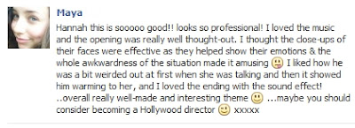
What I have learnt from this feedback is that even though all the comments here told me that people understood the concept, they didn't initially when watching the film and when they had watched the film the whole way through then they understood it properly. We have had mixed feedback from people who have understood it from the start to people who didn't understand the concept at all. What I have learnt is that the flashbacks to some people weren't easy to detect as flashbacks even though we edited the frames and took the saturation down and added a glow to give a flashback/dream effect. Even though most people did understand that these are flashbacks, a few people didn't and therefore didn't understand the concept as a whole. What I have learnt from this is that perhaps our flashback sequences weren't distinguished enough from the normal scenes and could have done with the effects a bit harsher.
I have also learnt that the music in our film is a strong point of our film. People felt it had set the tone of the film and helped communicate the humor more and that it reflected the film's mood and were happy that it was communicated through our music choice.
I have learnt from my audience feedback on my film that people enjoyed our film even though a few were a bit confused with our narrative at the start and that a simple narrative with the right editing and sounds can make an enjoyable film for an audience.
Poster:
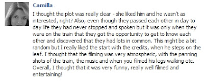
Here is one persons feedback I got from facebook back. This feedback shows that they thought the poster looked authentic and was clear to read in terms of colour choice and the layout we decided to use.
However, I did receive some constructive criticism here which was that they thought the image didn't work well as it didn't show the characters and their relationship the way it is portrayed in the film and gives off a different vibe and theme to our film. She says they "seem quite shocked and detached from one another" and also "seems different to what you were trying to get across in the film" which shows that the audience of the poster don't see from the poster the developing relationship or relationship at all between the characters and no suggestions of the comedy/romantic/friendship side to our film.
Review:
From this feedback I didn't really learn much as all of her feedback was positive and therefore couldn't improve on anything. What this shows is that we should check our work more next time for mistakes but other than that nothing sticks out needing to be improved from.
4. How did you use new media technologies in the construction, and research, planning and evaluation stages?
[Insert Prezi link here]
[Draft Prezi link: http://prezi.com/nhbizudk8ypa/how-did-you-use-new-media-technologies-in-the-construction-and-research-planning-and-evaluation-stages/ ]


.jpg)

Overall, this is a very good draft Hannah. Well done!
ReplyDelete1 The 9 frame analysis is good in that you have visually referenced several films, but you need to integrate the analyses of these into the notes below. At least one comment on how the film illustrates this convention is necessary, and preferably, some further examples, either new,or ones you used earlier. The comments on representation are vague, and need to specify gender and ethnicity and class. You need to consider the effect of ethnicity here, and consider the modernity of using a Black actor to represent the character. You establish social class in the opening, and this needs to be explained.The comments on genre are also vague, and need to consider how you are using romance particularly. Consider short film and feature film examples for conventions.
3 I think you should continue to get feedback on the review - 1 isn't enough! Also, you can learn from positive feedback that perhaps you were successful, or perhaps you are not asking the right questions?
4 This needs to be embedded. Have you clicked on public view?
4 The prezi should contain more than it does. What about poster construction? You need more images, or screen grabs -eg for garageband, indesign etc. There are typos that need correcting. Check that you have covered everything - did you use twitter? digital still camera? Check the list that we gave in class.
ReplyDeletePlease embed the final prezi in the blog. Make sure for the prezi that you are actually answering the question - this shouldn't in effect be just an identification of the technologies, but an answer to HOW you used them.
ReplyDelete