Wednesday, 25 January 2012
FILM REVIEW - PLANNING
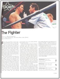
Little White Lies review.
This is an official review from one of the little white lies magazines which we will analyse all the areas to construct our own review.
Photoshop plan of Little White Lies magazine review layout
This is a draft of the design I did in photoshop of what the review layout should look like. The paper review issue which we will be creating ours for, has a different layout to the internet site and so I have made a photoshop plan here which we can refer back to when we don't have access to a paper version.
 This is where a high quality picture or still be used on the review at the top of the page. This will show the audience of this magazine a bit of our film and give them an insight into what out film could be about so we need to use an intreresting still or use our poster image.
This is some contextual information about the film that is located underneath the title of the short film. The 'Directed by' etc. information will be in regular format but will be a different font to the title to establish a different between the two pieces of information so the audience can identify the title and contextual information from each other. The information after these headings like the directors name is in italic format as well as bold format to highlight the difference between the header and information. It is also the same font as the header information.
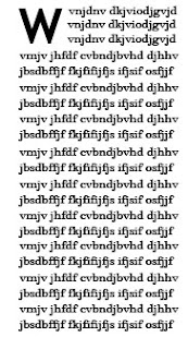
The first letter of the text is in a bold format of text which matches the title font of the film at the top of the page. The rest of the text fits around this letter as it has an indent to the first few lines due to the letter and will then be wrote as a normal paragraph layout with a middle allignment to it. The font in this section doesn't match the headers above about the contextual information as it is slightly tighter together as a font whereas the header iformation has large gaps between the letters. We will have to make sure we have a difference between the 2 fonts we use to show this on oour review to mimick the magazines format.

The first letter of the text is in a bold format of text which matches the title font of the film at the top of the page. The rest of the text fits around this letter as it has an indent to the first few lines due to the letter and will then be wrote as a normal paragraph layout with a middle allignment to it. The font in this section doesn't match the headers above about the contextual information as it is slightly tighter together as a font whereas the header iformation has large gaps between the letters. We will have to make sure we have a difference between the 2 fonts we use to show this on oour review to mimick the magazines format.
The font for the headings: 'Anticipation', 'Enjoyment' and 'In Retrospect' is in bold and italic to highlight this headings
THIS IS OUR FIRST DRAFT OF THE WORDS WE WILL USE IN OUR REVIEW.
HIGHLIGHTED IN PINK ARE THE THINGS THAT WE WILL NOW CHANGE AFTER SOME REVISING.
An inevitable encounter between two strangers turns into a heart-warming, humorous short film. With few major faults ‘Crossing Paths’ is head and shoulders above others in the new comers category and don’t directors Hannah Alfred and Hannah Mitchell know it. But we can’t help but be pleased for them revelling in the in the small but significant success of their film.
An upbeat tempo instantly brings us into the light-hearted disposition of the self proclaimed “rom-com”. Although by the end of the film there are giggles to be heard it hardly earns the label ‘comedy’ at all. Nevertheless one finds themselves drawn into the tale of two strangers who cross paths several times to eventually meet on a train, which is where the narrative really begins. Their relationship starts off with the female character (Zoe McNaughton) playing that token awkward person that has abutted us all at some point. Her first main role has been an unexpected triumph for the young British actress. However Jordan Khan’s performance (although creditable at times) lacks that extra enthusiasm that comes from an actor’s inner love of a character.
The story moves on quite rapidly to the show the characters relationship begin to prosper when they find that mutual interest that lights the flame which flickers slightly brighter in the heart of the female character, only to be harshly blown out in a wave of male ignorance. Although throughout the directors evoke a range of emotions from audience and achieve that level of professionalism which allows viewers to get drawn into the film. Hannah Alfred and Hannah Mitchell have reached that imaginary line of excellence that has was created for them in anticipation of this film, their direction and cinematography has excelled many others in but don’t quite allow them to play with the Hollywood big boys just yet.
With a miniscule budget as expected from these relatively lesser known producers the film has managed to find some adequate actors which live up to their full potential (but are a long shot from Brad and Angelina), some low budget but aesthetically pleasing shots and some unpretentious, appropriate music which really brings the film alive. However its real success lies in the combined efforts of the directors who really captured their simplistic yet realistic vision of an encounter that millions could relate to.
Thursday, 19 January 2012
YOUTUBE TITLE
As our target audience is around the teenage group, the main way they will see our film is on the internet and the site Youtube. For this, we need it to be easily found on the internet so when people search for it they will find it.
1) When Hannah uploaded the film yesterday, she named it on YouTube "Hannahs final film". When I went home and tried to search for our film, I couldn't find it on YouTube unless I used the filter 'recently uploaded' and it was already on page 2 of this filter. When I also searched for it, it came up with 5,640 results so it would be hard for our audience to find our film through all the pages worth of videos and results.
However if you type it in with inverted commas "hannahs final film" it does come up with the correct results.
2) After changing the youtube name to a more specific name with our film (using our title and both our names), when I searched for it, only 44 results appeared which meant it was a lot easier for our audience to find the video now. I challenged one of my family to find my film on their laptop and where able to find it on the first page now which means we are able to get more traffic to our film and more people to see it and make it more popular.
3) It is also the first result that comes up on the page so people can easily see it and a lot of people would click on the first video they see on youtube to watch so this will create more popularity for us on the internet.
Wednesday, 18 January 2012
AUDIENCE FEEDBACK ON FINISHED FILM
We asked 3 different groups for feedback on our finished film after they had watched it and their thoughts on it as well as what they thought the concept of our film was. These 3 groups were all in the age group for our target audience and we asked 1 all male group, 1 all female group and 1 mixed group on their opinions on the film. Here are some bullet points on their thoughts and notes on our film.
YOUTUBE FEEDBACK



FACE TO FACE FEEDBACK:
Group 1: All male group- They liked the effect of the flashback sequence as it differed from the normal shot colors and was easily identifiable as a flashback sequence.
- The actors and acting in our film was good and created a realistic sense of the characters to our film.
- They couldn't pick out any faults in any sequences like breaking the 180 degree rule or any continuity errors.
- They understood the concept clearly and understood that they hadn't ever met before but had crossed paths in their life before but not noticed each other.
Group 2: All female group
- Liked the simplicity and the simple idea of it as a whole and thought it worked well
- They understood the concept fully and said they really enjoyed watching it while they called the idea "awesome"
Group 3: Mixed group
- The end is "amazing" and sets the story and the mood of it
- They felt the emotion build up in the film right until the end and then it is all taken away
- Prefer these credits than the previous credits as it breaks up our continuous long shot
- Liked our use of sound effects and they blend in well e.g. train announcements and background sound
- Not like a stereotypical student film concept
YOUTUBE FEEDBACK
We have also had an inbox from a Youtube user leaving feedback and what he thought on our film:
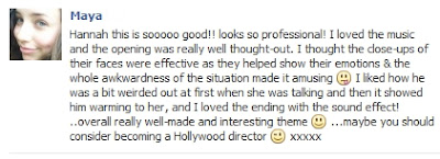
FACEBOOK FEEDBACK:
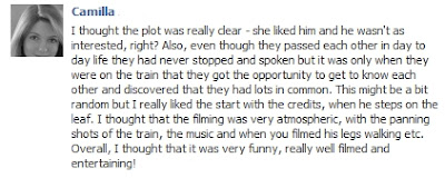
Me and Hannah have both out the film up on our facebooks to our friends and we have both received some feedback from them. We will both post the different feedback responses we received from our friends on here.


This is the second set of feedback from Facebook friends:
Monday, 9 January 2012
DRAFT POSTER AND DRAFT LOGO
Me and Hannah have both created various poster designs from our research now and will discuss these tomorrow when we meet to do more editing. We will try and come to a decision of what to include and what features we like and what we don't like on others and come up with one draft design which we can them work from.
WHAT THE POSTERS ARE SHOWING:
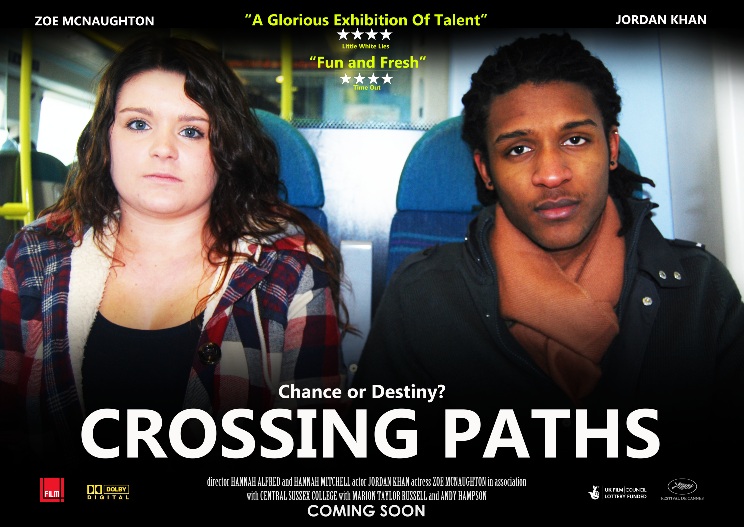
1. This is our final draft poster. We have incorporated the train element by having a sign that is hanging off our title. This also really emphasises the comedic effect and reflects on their relationship which ends quite broken. The characters are positioned back to back as it encourages the audience to explore their vast differences. Her body language will be slightly more turned towards him and his eyes only shifting towards hers indicating the relationship between the two. Hopefully by still leaving some of the background the poster is on we will still give the impression of a poster within a poster.
1. This is our final draft poster. We have incorporated the train element by having a sign that is hanging off our title. This also really emphasises the comedic effect and reflects on their relationship which ends quite broken. The characters are positioned back to back as it encourages the audience to explore their vast differences. Her body language will be slightly more turned towards him and his eyes only shifting towards hers indicating the relationship between the two. Hopefully by still leaving some of the background the poster is on we will still give the impression of a poster within a poster.
7. This was the version before our final version but we had to adjust it because after asking a few people they highlighted to us that with the sign at the top of the poster it meant that there was too much blank space and if we made it any smaller it would look too random.
2. This was one of the versions that we did not talk about in the video but the idea is basically having the characters on the opposite sides of the poster with the background being them on a platform and then using one of the signs where the station name would normally go to put our film title in.
3.This idea involved using one of the establishing shots in the beginning of our film to be the background for our characters, this means we would have the train station in the background and we could use the sky as a clean space to put our text on.
5.This idea was just a quite sketch to demonstrate our thoughts about incorporating some train rails into our poster.
6. This demonstrates one of ideas we had about using a similar picture of the two characters from the film so basically them two on the train.
Draft Poster design in Photoshop:
WE DECIDED THAT THIS POSTER DESIGN WAS NOT RIGHT FOR OUT FILM AS IT LOOKED A BIT BORING AND DIDN'T REPRESENT THE CHARACTERS RELATIONSHIPS CORRECTLY.
Here is the draft poster I created with the images we had taken on the train station. This poster apparently did not work well though as it seemed slightly unclear that it was a train station. It also apparently represented the characters relationship differently to what we see in the film. The image of them standing back to back shows a more 'romantic' side of their relationship which we didn't want as it would target the wrong audience to our film thinking it was a romantic film when we actually have it as comedy with some friendship and relationship themes in there as well. We decided to opt for a different design so that we targeted the right audience and gave off the right message to the audience and viewer of the poster.
Photos for our poster
We took out a digital SLR camera to the train station so that we had good high quality images for our poster as we didn't want to have low quality images which didn't look good on the A3 poster. We needed high quality images as the size of the poster is A3 which is very large. Here are 8 images which were our favourites and ones we wanted to incoporate.
Even though we had favourites, we still had a large choice of images to choose from as we took a large quantity of images on the train station and on the train to ensure we had enough for our poster as we didn't know if we would have another opportunity to take images so we had to make sure we had enough and make the most of our time.
WE DESIGNED A FEW NEW POSTERS WHICH WE HAVE DONE USING A SCREEN GRAB FROM THE FILM AS WELL AS AT THIS POINT WE DONT HAVE THE EXACT IMAGE WE WANT YET. HOWEVER IT DOES RESEMBLE THE IMAGE WE WILL USE FOR OUR FILM POSTER BUT THE CHARACTERS WILL JUST BE LOOKING AT THE CAMERA PERHAPS AND IT WILL BE MORE ALIGNED AND HIGH-RESOLUTION. IN THE THREE VERSIONS OF THE DRAFT POSTER BELOW THE ONLY THING THAT HAS CHANGED IS THE POSITIONING OF THE TITLES AS WE COULD NOT DECIDE WHICH WOULD BE MOST EFFECTIVE. SO WE ASKED A TOTAL OF 14 PEOPLE FROM OUR TARGET AUDIENCE WHICH ON THEY FELT WAS MOST EFFECTIVE. VERSION 1 WAS THE OBVIOUS WINNER SO WE WILL TRY STICK TO THOSE POSITIONING.
VERSION 1
VERSION 2
VERSION 3
HANNAH ALFRED - MORE POSTER RESEARCH
SHAME
Narrative: This poster tells me that the story is one of a troubled relationship between the two characters because of the facial expressions and the title of the film 'shame'.
Representation: The images chosen really portray and contrast masculinity and femininity, especially because it is only them in the images, made possible by the size of the images. The man has harder lighting which is typically used when portraying masculinity and the woman with softer lighting to portray her as more femininity.
Genre: The poster seems to be a Drama. We are shown this because the facial expressions of the characters really convey strong emotions and emphasis is on them. Quite often dramas involve people of the opposite sex as well.
Target Audience: The target audience is at least 18 years or older because of the age certification on the bottom of the poster.

JUNO
Narrative: This poster tells me that the story is one of teenage pregnancy which is given away because of the two teenagers that has been chosen as the main image with the girls belly bump made prominent by her sideways position.
Representation: The images chosen represent teenagers perhaps in a negative way because we see a very young girl who is heavily pregnant and a confused looking teenage boy, which has bad and challenging connotations. Masculinity is not represented traditionally because he doesn't have some stereotypes of males being very confident and stern, he comes across more weak than the female character which is a more modern concept. The girls representation isn't stereotypical either because she isn't loving towards the male character as perhaps some would expect a female to be in her situation and her body language is turned away from him, she seems more confident and mature than him.
Genre: The large quotation shows that this is a comedy because it uses words like 'funny'. The body language of the male character is quite humorous as well.
Target Audience: The age rating for the film is PG-13 however I think the target audience is perhaps a bit older than that because of the issues the film deals with and the age of the characters.
MY DRAFT
Narrative: This poster tells me that the story is about the two teens in the picture and by their body language we can tell they have a somewhat awkward relationship but also the girl is perhaps more intrigued by the boy as she is more turned towards him. The title 'CROSSING PATHS' also gives a hint that perhaps it is something to do with the two characters 'crossing paths'.
Representation: There are four groups that we can see are being represented in this poster: masculinity femininity, teenagers and ethnicity.
Genre:The quotation used something like 'witty' will show that it is humorous therefore comedy.
Target Audience: The target audience is shown by the age of the characters- teenage.
PRACTICE
In order to create a really professional looking poster I needed to practice my photo manipulating skills. So I did the task of trying to recreate an already established successful poster that has used the technique of manipulating photos itself.
Here is the original and my version. There are obviously a lot of differences between the two because I had to get all of my own images off the internet myself. Then I had to combine all the separate elements of the images one by one - like the background, the three separate characters, the pier and the the text. I can now use these skills I have learnt when creating my own poster.
Tuesday, 3 January 2012
HANNAH MITCHELL - MORE POSTER RESEARCH
I chose these posters to do my research on as they are both films that have a similar target audience to our film so I can see what kind of features are used to reflect out audience and communicate to them through the posters.
After research and looking into more posters that exist in the film industry, I decided to make some more poster designs to improve the first designs and these didn't include enough detail about our film. The first one is a design I made on the computer on an image manipulation program to see what the design would look like on the screen and with real images. The reason I wanted it to see it on the screen is also because when we advertise our poster for our film, it will probably be on the internet to attract attention so I wanted to see a mock-up on the computer for this reason.
The poster includes a quote from the review that the film would be given so the audience can be given some insight onto how good it is and therefore, attract them to watch it. It also has a use of a train track image to show the film has something to do with trains or train tracks but doesn't give too much away about our film as we don't want to give away lots and want to keep the audience interested in to the film's narrative. I also put the Crossing Paths text on the shadowed part of the train track so that they would show up against the background and not blend in too much. The white color in comparison to to the black also shows the difference and shows the difference between the title and other information.
My 2nd design is on paper as we haven't obtained the images of the characters we need yet so I have had to draw it in order to produce it. This image shows out two characters at either side of the poster. It also has anchorage with the actors name above their characters picture to show the audience who plays which character in this film. Then in between the 2 characters is a train track - this would probably be a photo rather than a cartoon as the cartoon may detract from the image as a whole as well as not fitting in with the poster as the rest is all photos and most posters are all cartoon OR all photos but don't generally mix. The 'Crossing' and 'Paths' would run parallel against the vertical line of the train track and at different sides so it isn't in a center alignment like most posters and plays around with the space more.
Some things I did not include that would need to be added in the future would be review quotes shown, funding and the list of directors/producers etc, at the bottom. One thing to remember though when we show funding is that we shouldn't include 2 big companies that would compete against each other like BBC and Film4 as this wouldn't happen because they wouldn't work together.
SOUND EDITING & RESEARCH - POST PRODUCTION
Today me and Hannah have been researching sound on the internet trying to find some music for our film. We have found a few royalty free music sites and have been looking through their music and will continue to do some tomorrow. We have found a few songs which have an upbeat rhythm of a guitar in but then have people singing in different languages on but these songs could add another dimension to our film and make it quite quirky.We also need to add in our diegtic sound like the train announcements later on so that the audience can hear the announcement clearly.
Me and Hannah have now finished editing our film and have added the final touches like titles and sound and have now exported the finished movie. We had a problem with the soundtrack and that was trying to find a soundtrack that reflected the mood of our film as we wanted an upbeat rhythm of a song but to have a slight comidic tone to it to enhance our comedy in our film as well as a slight romantic touch to it to hint tot the audience that perhaps that is where the film could lead both the characters.
For our main soundtrack (that has the comidic tone added to it) and is used at the beginning and middle of our film. We found the website www.incompetech.com which allowed us to browse lots of royalty free soundtracks which we were allowed to use as these pieces are donated to the website for people to use without any copyright issues.
We found a soundtrack called "There is Romance" which is a very typical romantic cliche song and we wanted it to be cliche to add more comedy to the situation. The added sound of the soundtrack aburptly scratching to a stop also added even more of a sesne of comedy.
Me and Hannah have now finished editing our film and have added the final touches like titles and sound and have now exported the finished movie. We had a problem with the soundtrack and that was trying to find a soundtrack that reflected the mood of our film as we wanted an upbeat rhythm of a song but to have a slight comidic tone to it to enhance our comedy in our film as well as a slight romantic touch to it to hint tot the audience that perhaps that is where the film could lead both the characters.
For our main soundtrack (that has the comidic tone added to it) and is used at the beginning and middle of our film. We found the website www.incompetech.com which allowed us to browse lots of royalty free soundtracks which we were allowed to use as these pieces are donated to the website for people to use without any copyright issues.
 |
| www.Incompetech.com where we found one of our soundtrack pieces |
 |
| Our soundtrack piece on the site When searching through the tags and genres of music, hannah found a piece of music which we thought fitted perfectly. The name of the piece is "Brightly Fancy" and we felt it had a real upbeat rhythm to it while also have a slight hint of comedy to it. One issue with it though was that it was only 2:15 long. We resolved this problem though as we only used the soundtrack in the parts where they weren't talking and so we were able to use it all without it cutting out in the middle as we only used it for 2 reliatively short sections. We also wanted a romantic soundtrack at the end of our film which was to then having the sound of a record abruptly stopping to add more comedy to the film and enhance the comedy of the moment even more in the sound. We used a different website for this piece called www.jamendo.com: |
TITLE EDITING- POST PRODUCTION
This is our orginial titles (highlighted in red) that we had which we liked at first because we thought that it would be worth the effort in making all of the titles be motion tracked onto various lines in the frames. However there were sevel problems with this version of our titles.
1. There was a lot of shaking of the actual words of the titles which had to be centered because they were in moving clips and it looked really unproffessional. No matter how much we tried we could not get it to move along with the clip perfectly.
2. There would be continuity errors because some of the titling clips were created using different methods which was apparent.
3. The titles were right at the begining of the film which I think now in hindsight is a bit predictable. Also them being at the begining ment that they were on the opening shots which distracted from the jobs of the establishing shots - setting the scene.
4. We felt this style did not fit our genre of film because its a bit serious and futuristic perhaps.
This is our final titling that we decided to stick with which we thought worked a lot better than the orginal one for a variety of reasons:
1. We thought it would look more professional to have the titles displayed in a more simple way - like we have here, neatly in the middle of the screen.
2. The shot that the titles are overlayed on now is one long continuous shot which was quite long and boring before but now has an added dimention of interest. It is perfect because it really frames the titles in that one long shot.
3. This method of displaying our titles meant that it was easy for us to add the role of the name mentioned which again looked more profession and ment that the titling had an obvious meaning for being there.
4. We could also now keep all the text the same white colour to further inhance the brand we are trying to build.
This is our main title. We called our film 'crossing paths' because the word 'crossing' has connotations of railways and the facts that the two characters are constantly crossing paths and they don't know it.
1. The title gives an insight into what the film is about so people can understand it better from the beginning.
2. It is big and bold because it suits our genre.
3. The size works well because as the title crawls in from the right it follows the foot of the male character.
TITLE RESEARCH - POST PRODUCTION
Love sick has somewhat been one of our inspirations as it has a lot of simularities to our film. It is a short film and our audience are young. We liked the simplicity of the films title 'Love sick' and the large font. This example shows the text overlayed over the footage.
This was another type of titling we could use which involves the text on a black background. We liked this technique aswell because it makes the audience focus on the titles making it more memorable. We only wanted to look at films with a simular audience as ours because we could then get a better idea of what kind of font to use for our film.
In the opening sequence to the film seven they also overlay the titles on the film footage aswell as adding them on top of a blackscreen, an imalgramation of the two.
Fonts:
Hiragino Katu Gothic font
This font we feel would be really good as it looks very modern and would therefore, work well to reflect and attract our target audience, who we want to aim it at.
When editing and experimenting with fonts, this font we found on the Mac computer was something we really liked in all capital in particular as this made it appear more bold whilst not drawing all the attention off our moving background. We also liked the captitals because it did not have any serifs which looked more modern.
When editing and experimenting with fonts, this font we found on the Mac computer was something we really liked in all capital in particular as this made it appear more bold whilst not drawing all the attention off our moving background. We also liked the captitals because it did not have any serifs which looked more modern.
Lucida Grande
We also used this font while experimenting with our titling and also really liked this font. While it had similarities to the other font, it was slightly slimmer and we thought it could be more suitable and more subtle on our footage than the other font. It again, reflects our target audiences as it is a modern and 'young' font. However we didnt like that it is a bit too plain and so it would be hard to build a 'brand' with it and have the font be associated with our film.
Handwriting fonts
When looking through fonts, we decided that we would not use a handwriting font on our titling. It would be hard for our audiences to read it on the background and it is more suited to a romance or sad film and it has common associations with films of those genres, therefore we wouldn't want to give the wrong inpression, so we wont be using it.
Titling layout ideas:
Orginally we wanted to create some interesting ways of representing our titling on our film. These are some of the ideas we came up with. However in the end we decided to go mainly with the more plain ideas because of the background we had to fit it into.
First idea:
This was our first idea and we wanted the words to be incorporated in between another so that they joined and linked. We felt this gave a very creative side to our titling and something not used much in movies. However though, with this idea it would be very hard to include on shots as it would detract quite a lot of attention away from our our actual film shots.
Second idea:
This was our second idea to incorporate in our shots for our titling. We both really liked this way the text was laid out but unfortunately it didn't work as we wanted as not all the letters showed in the text box so it was cut off. We therefore couldn't use this layout idea.
This was our second idea to incorporate in our shots for our titling. We both really liked this way the text was laid out but unfortunately it didn't work as we wanted as not all the letters showed in the text box so it was cut off. We therefore couldn't use this layout idea.
Third idea:
This idea was our third idea and the best one we had out of these 3 as it fitted all the way and doesn't detract too much attention away from our film shots. However, it may be slightly difficult for the audience to read what it says which is our only concern.
This idea was our third idea and the best one we had out of these 3 as it fitted all the way and doesn't detract too much attention away from our film shots. However, it may be slightly difficult for the audience to read what it says which is our only concern.
Subscribe to:
Comments (Atom)
