Little White Lies review.
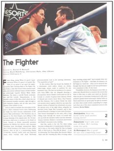
This is an official review from one of the little white lies magazines which we will analyse all the areas to construct our own review.
Photoshop plan of Little White Lies magazine review layout
This is a draft of the design I did in photoshop of what the review layout should look like. The paper review issue which we will be creating ours for, has a different layout to the internet site and so I have made a photoshop plan here which we can refer back to when we don't have access to a paper version.
 This is where a high quality picture or still be used on the review at the top of the page. This will show the audience of this magazine a bit of our film and give them an insight into what out film could be about so we need to use an intreresting still or use our poster image.
This is some contextual information about the film that is located underneath the title of the short film. The 'Directed by' etc. information will be in regular format but will be a different font to the title to establish a different between the two pieces of information so the audience can identify the title and contextual information from each other. The information after these headings like the directors name is in italic format as well as bold format to highlight the difference between the header and information. It is also the same font as the header information.

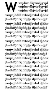
The first letter of the text is in a bold format of text which matches the title font of the film at the top of the page. The rest of the text fits around this letter as it has an indent to the first few lines due to the letter and will then be wrote as a normal paragraph layout with a middle allignment to it. The font in this section doesn't match the headers above about the contextual information as it is slightly tighter together as a font whereas the header iformation has large gaps between the letters. We will have to make sure we have a difference between the 2 fonts we use to show this on oour review to mimick the magazines format.

The first letter of the text is in a bold format of text which matches the title font of the film at the top of the page. The rest of the text fits around this letter as it has an indent to the first few lines due to the letter and will then be wrote as a normal paragraph layout with a middle allignment to it. The font in this section doesn't match the headers above about the contextual information as it is slightly tighter together as a font whereas the header iformation has large gaps between the letters. We will have to make sure we have a difference between the 2 fonts we use to show this on oour review to mimick the magazines format.
The font for the headings: 'Anticipation', 'Enjoyment' and 'In Retrospect' is in bold and italic to highlight this headings
THIS IS OUR FIRST DRAFT OF THE WORDS WE WILL USE IN OUR REVIEW.
HIGHLIGHTED IN PINK ARE THE THINGS THAT WE WILL NOW CHANGE AFTER SOME REVISING.
An inevitable encounter between two strangers turns into a heart-warming, humorous short film. With few major faults ‘Crossing Paths’ is head and shoulders above others in the new comers category and don’t directors Hannah Alfred and Hannah Mitchell know it. But we can’t help but be pleased for them revelling in the in the small but significant success of their film.
An upbeat tempo instantly brings us into the light-hearted disposition of the self proclaimed “rom-com”. Although by the end of the film there are giggles to be heard it hardly earns the label ‘comedy’ at all. Nevertheless one finds themselves drawn into the tale of two strangers who cross paths several times to eventually meet on a train, which is where the narrative really begins. Their relationship starts off with the female character (Zoe McNaughton) playing that token awkward person that has abutted us all at some point. Her first main role has been an unexpected triumph for the young British actress. However Jordan Khan’s performance (although creditable at times) lacks that extra enthusiasm that comes from an actor’s inner love of a character.
The story moves on quite rapidly to the show the characters relationship begin to prosper when they find that mutual interest that lights the flame which flickers slightly brighter in the heart of the female character, only to be harshly blown out in a wave of male ignorance. Although throughout the directors evoke a range of emotions from audience and achieve that level of professionalism which allows viewers to get drawn into the film. Hannah Alfred and Hannah Mitchell have reached that imaginary line of excellence that has was created for them in anticipation of this film, their direction and cinematography has excelled many others in but don’t quite allow them to play with the Hollywood big boys just yet.
With a miniscule budget as expected from these relatively lesser known producers the film has managed to find some adequate actors which live up to their full potential (but are a long shot from Brad and Angelina), some low budget but aesthetically pleasing shots and some unpretentious, appropriate music which really brings the film alive. However its real success lies in the combined efforts of the directors who really captured their simplistic yet realistic vision of an encounter that millions could relate to.


Good - you've got the layout broadly right here.
ReplyDelete